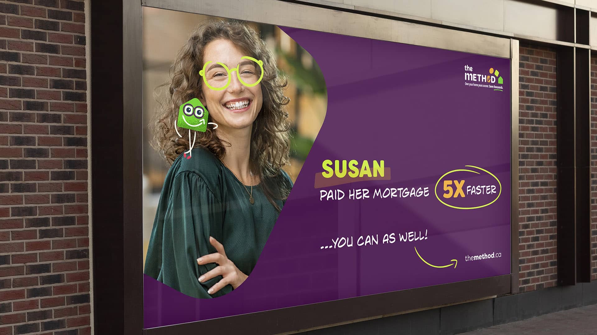
Through meticulous research, creative design, and the development of a memorable brand mascot named «Thod,» we’ve revitalized The Method’s brand identity. In essence, we’ve transformed The Method into a brand that doesn’t just function efficiently but also captivates and emotionally connects with its customers through a vibrant brand mascot, we wanted to make The Method feel easy, manageable, and simple. We want people to feel like anyone can do it…and should. It should appeal to people who are curious, but also to people who are anti-bank. It is a system for the every-man.’s engaging interactions.
In order to connect the target audience to the product’s value, we need to make it easy for people to understand the concept of The Method. In that approach, we designed a brand identity that communicates this.
We will also explore the origins of The Method and the available recordings of it being taught to live audiences in an effort to identify simple elements that can tie the teaching to the proposed toolkit product – things like a whiteboard, markers, and lines.
Thod, The Method mascot character matches the brand in terms of look and feel, it is a charismatic character, and isn’t just a static emblem; it actively interacts with the audience, breaking the fourth wall to provide insights and guidance on financial education. This integration has not only made The Method’s brand trustworthy, approachable, and relatable but also ensured a unified, modern visual identity across all communication channels, from the website to the digital environment.