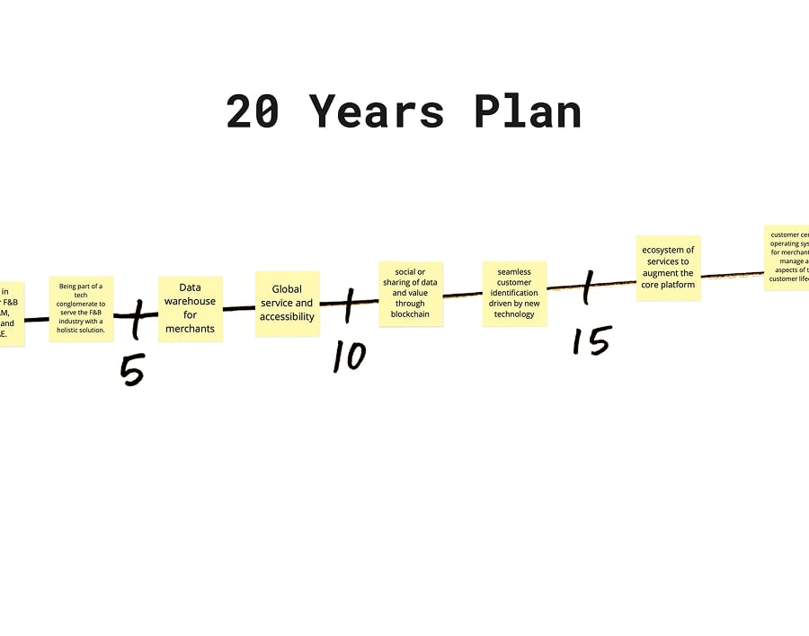
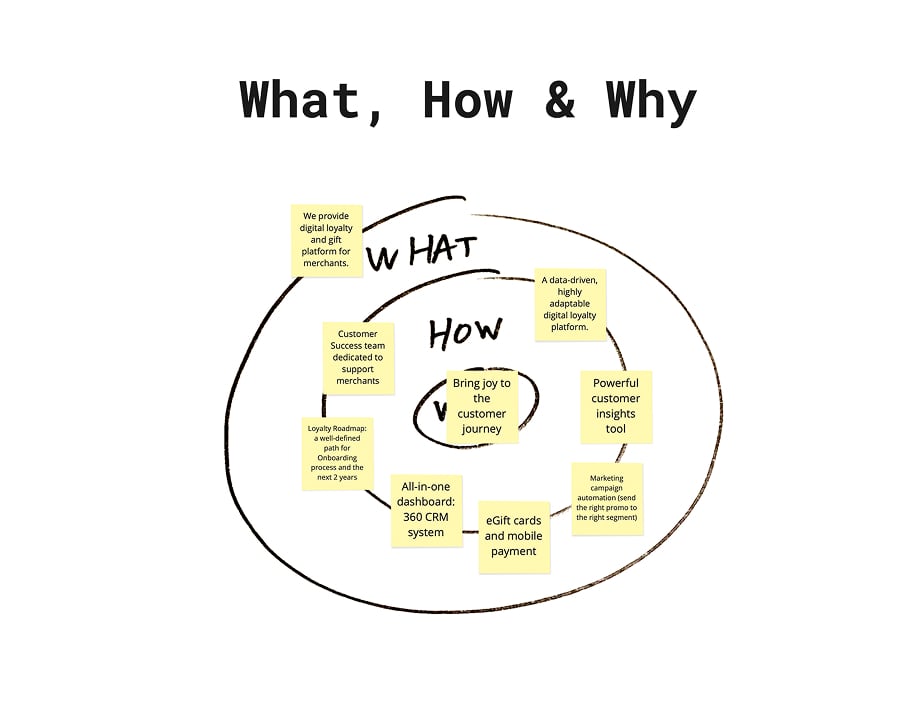
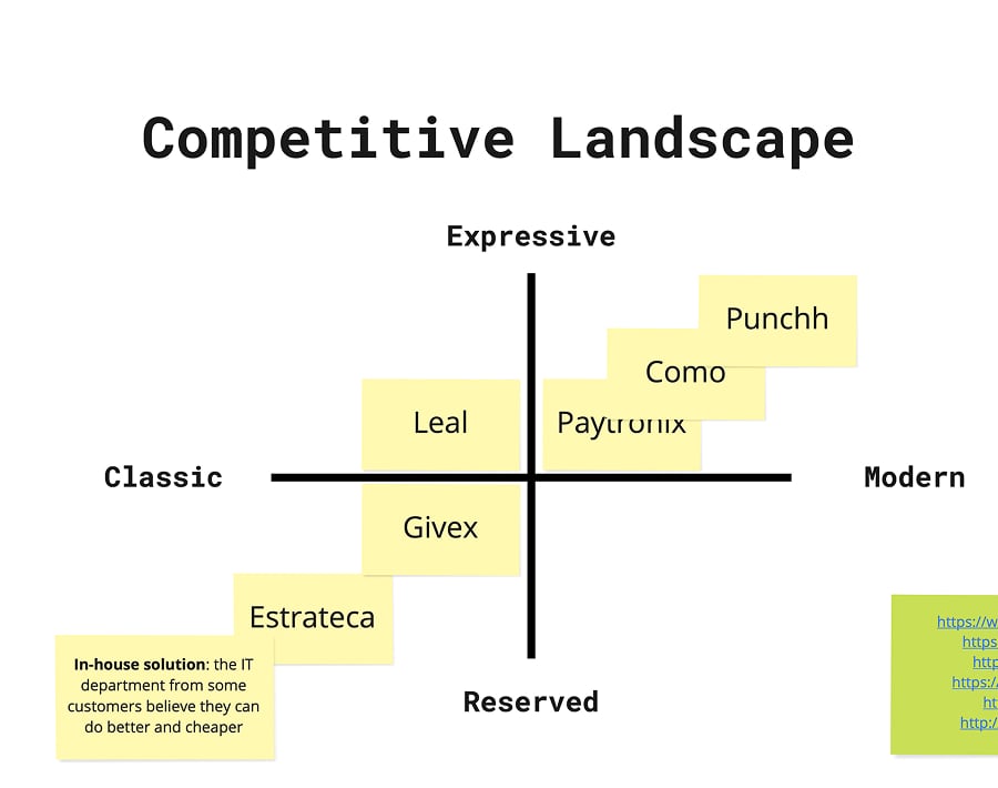
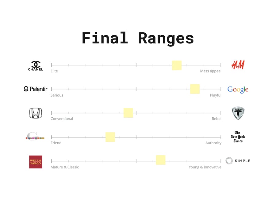
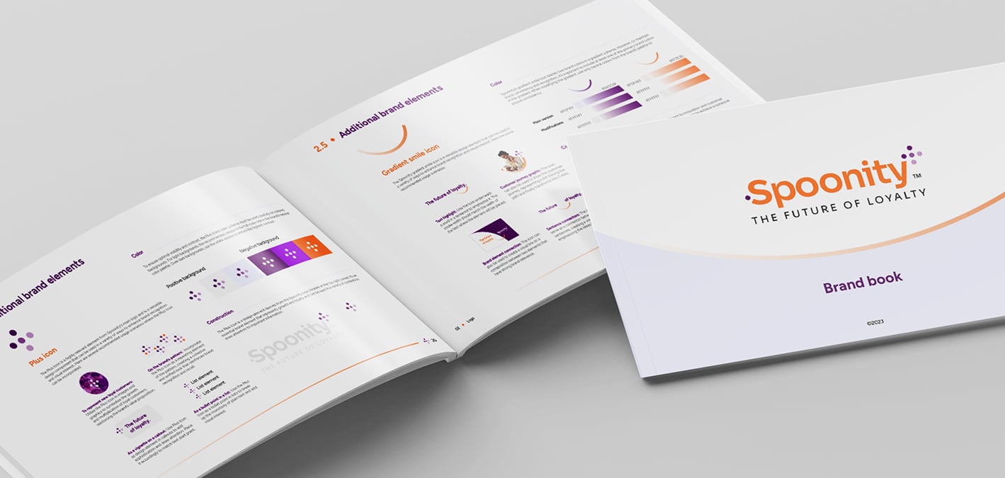
To transform Spoonity’s core strategy into an expansive visual language, we developed a system driven by customer movement, data, and growth:
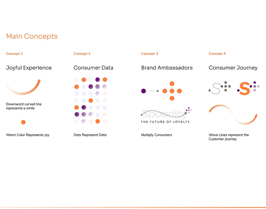
THE DOT SYSTEM & MULTIPLICATION: We designed a dynamic graphic motif where single dots represent individual customers. As engagement grows, these dots form plus-shaped clusters, visually telling the story of customer advocacy and business expansion.
DYNAMIC GRADIENTS & MOVEMENT: Soft gradient lines and organic curves were introduced to visually illustrate the customer journey, injecting fluid movement and energy across digital and print touchpoints.
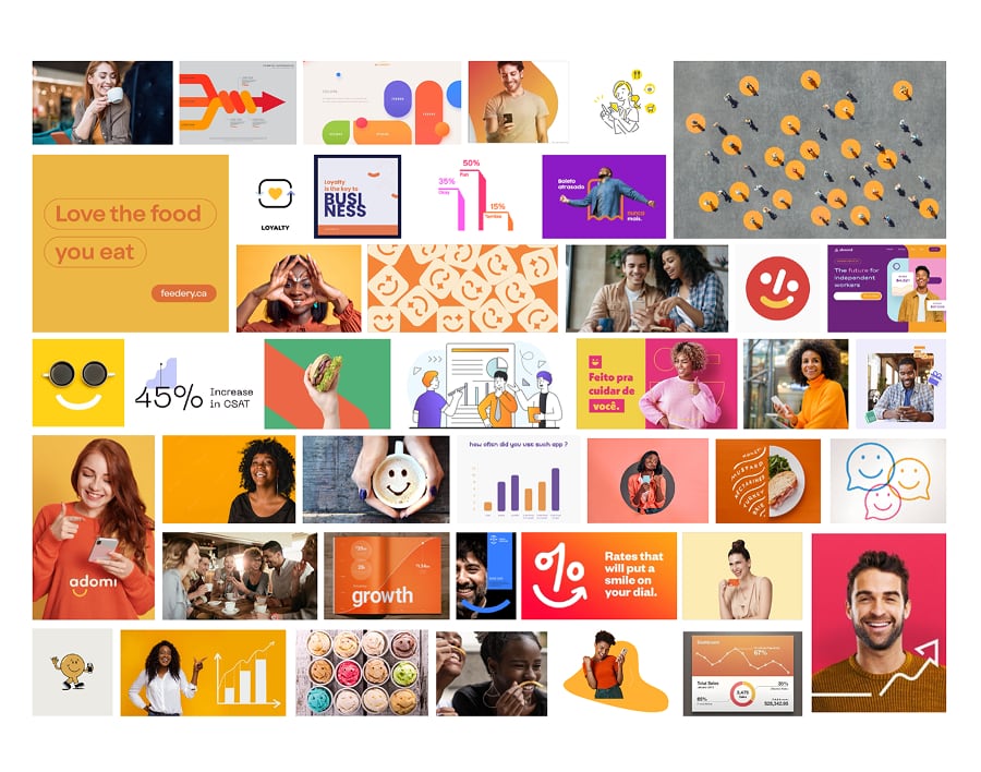
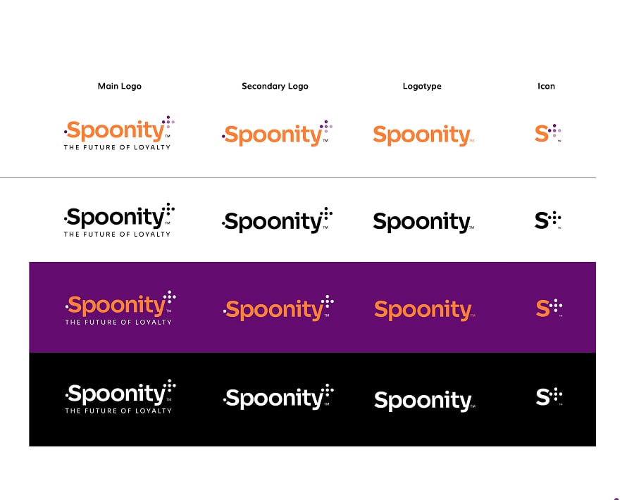
BALANCED COLOR PALETTE: A vibrant orange and purple palette was selected to hit the sweet spot between friendly optimism and tech-forward innovation, setting Spoonity apart from traditional corporate SaaS competitors.
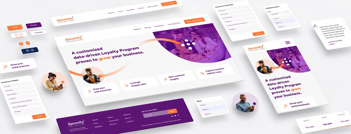
MODULAR WEB & UI DIRECTION: We established a comprehensive UI kit and design system featuring rounded container layouts, custom product mockups, and structured typography to simplify complex product features for B2B buyers.