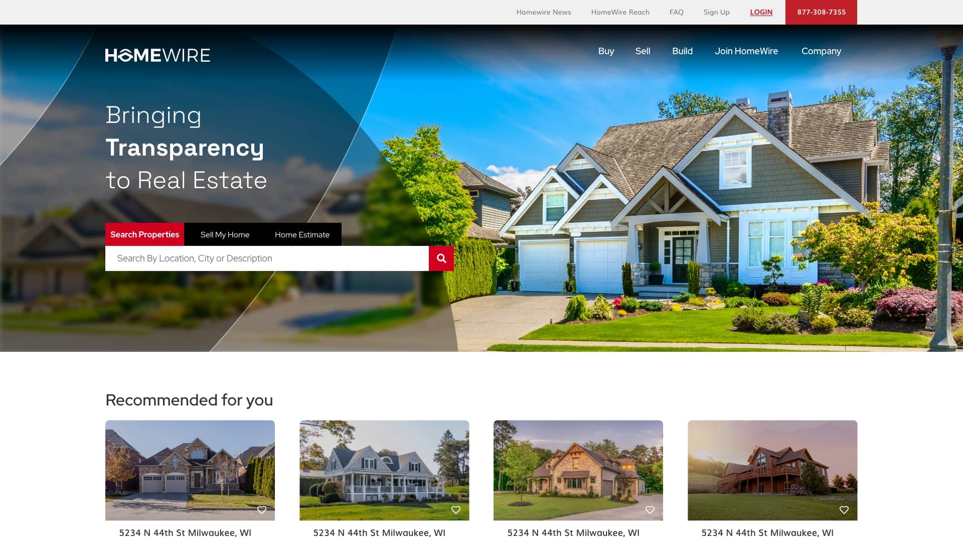
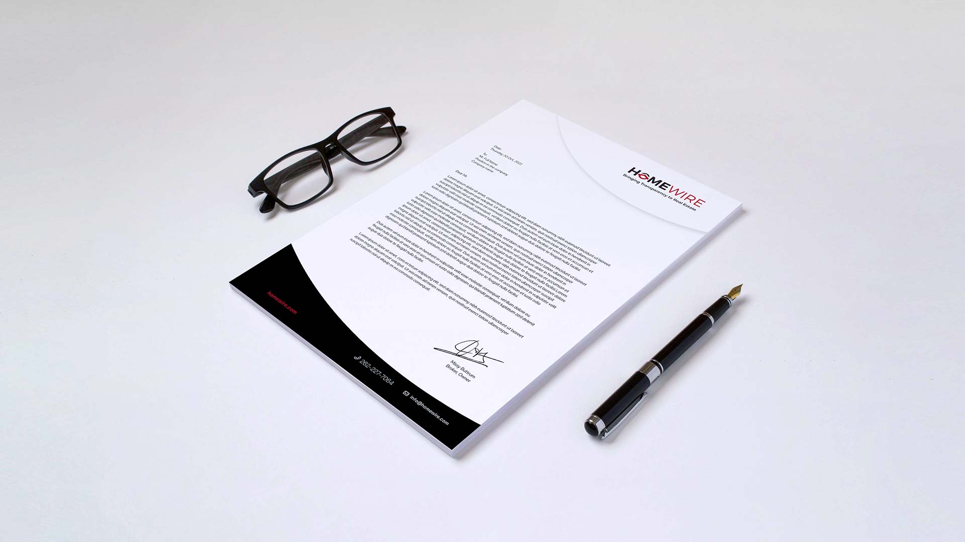
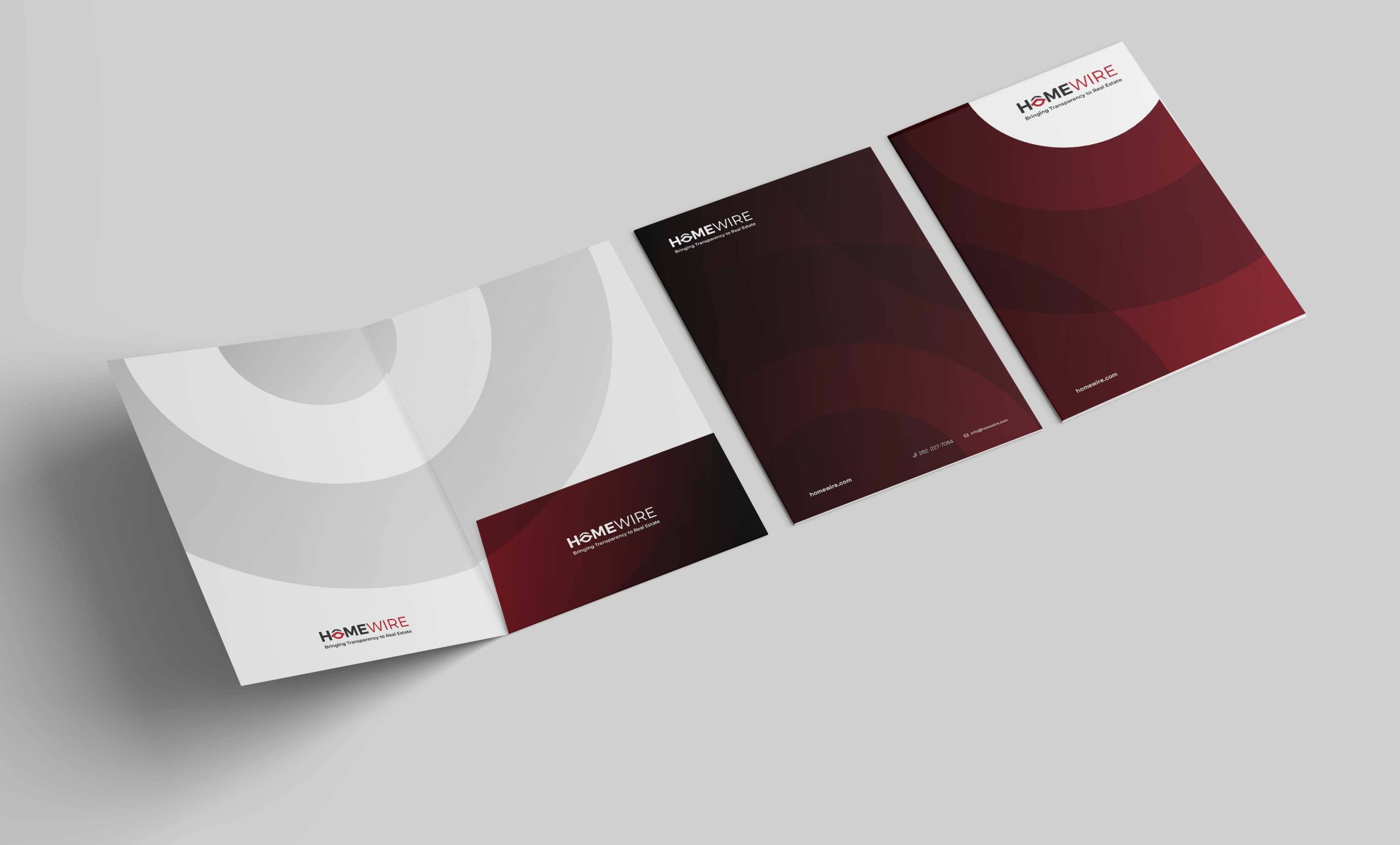
The Rebranding process will consider all the positive features retained by the current brand and to do diverse improvements to empower the potential enclosed behind the core features of this brand. Aligned to the project objectives, we developed the new brand around four concepts: Round Shapes, Core Values, Transparency, and Minimalism.
ROUND SHAPES
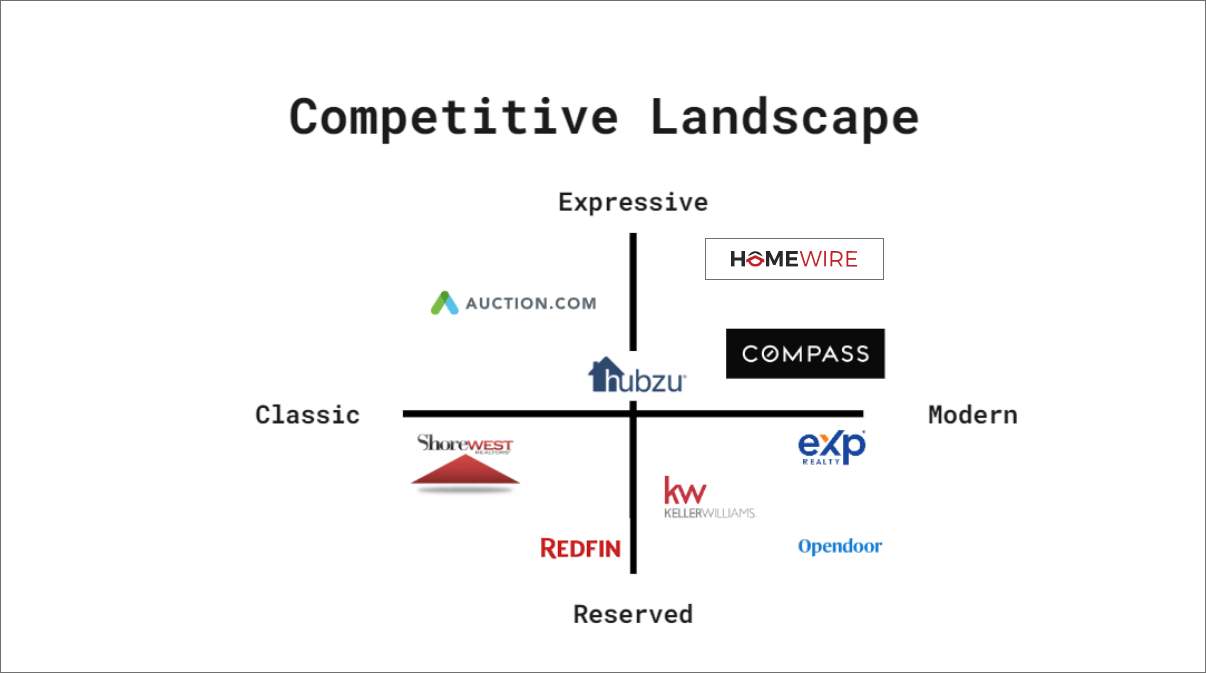
Homewire pursue to be recognized by people without associating its brand with any other competitor, therefore, it is important to have its own visual identity that helps its Brand Positioning on every touchpoint of the brand experience, since its communication to any graphic. In fact, we decided to bring some features from its Logo Icon, and distinguish itself from its competition, we have used round shapes as the conceptual basis of all their branding strategy. Round shapes instantly set Homewire apart from all of its competitors, who mostly use sharpen shapes, we have used round shapes as the conceptual basis of the visual language. In addition, due to a social and cultural convention, round shapes usually convey a feeling of warmth and harmony, which combine perfectly with the brand’s values.
CORE VALUES
Homewire is a company deeply rooted in its values, using the acronym TARGET to encapsulate its core principles: Transparency, Accountability, Relevance, Gratitude, Excellence, and Thriving. «T» stands for Transparency, emphasizing its commitment to openness and scrutiny. «A» signifies Accountability, with a dedication to being answerable for all actions and decisions. «R» denotes Relevance, showcasing its impact on the real estate industry. «G» signifies Gratitude, as Homewire expresses kindness and generosity to all industry peers. Lastly, «E» embodies Excellence, as the company strives for top-tier service, and «T» underscores its focus on Thriving by continuously improving and achieving new milestones, all fueled by a dedication to winning people’s trust and speaking to their hearts.
TRANSPARENCY
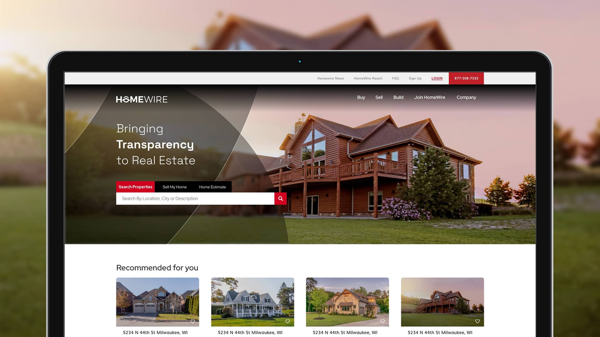
Homewire’s strong grasp of its operations and unwavering commitment to transparency make it a standout in the real estate industry. Transparency, a central value and the company’s guiding motto, is artfully integrated into their brand graphics. Amidst an often unclear industry landscape, Homewire’s visual identity incorporates transparent elements, symbolizing their commitment to clarity. This unique brand characteristic not only solidifies Homewire’s position in the minds of its audience but also distinguishes it from competitors who have yet to embrace this resource, setting the company apart with a distinctive personality in the industry.
MINIMALISM
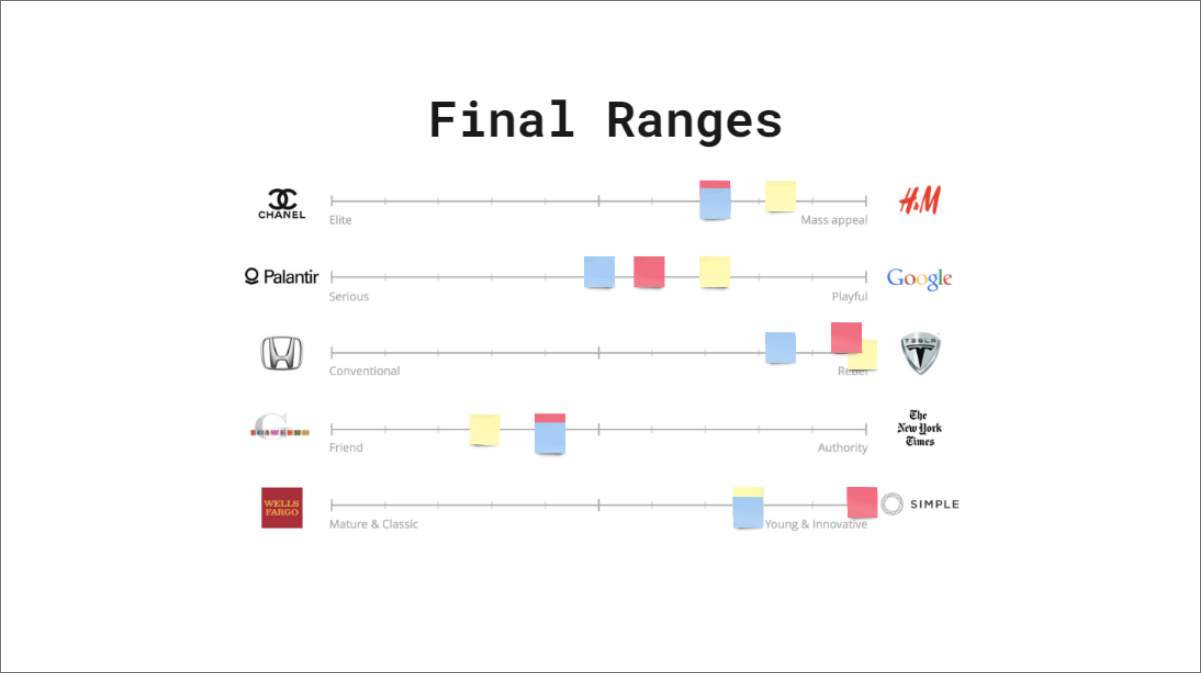
Homewire is introduced as a young and innovative brand, as well as serious, and that knows what it does. Homewire’s values are their foundations for everything. That is why it shows a minimalist look, easy to understand, with a clean aspect where you can see a few elements presented in a simple and orderly way. It focuses on the idea of “less is more”. Homewire is clean, balanced, concise and straight to the point. Another brand characteristic we seek to develop is to bring it a Techy look and feel. Minimalism will influence to show that feature on the brand, at the same time to show innovative appealing on its branding. Homewire brand will reflect high quality by using minimalism as a rule in its visual communication.