Scalable Loyalty Platform & B2B Brand System

Spoonity

About Project

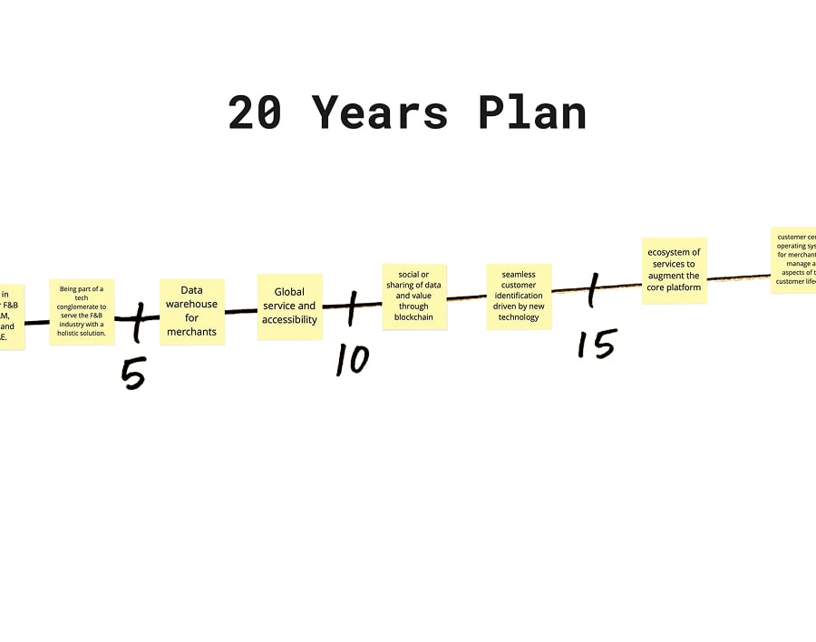
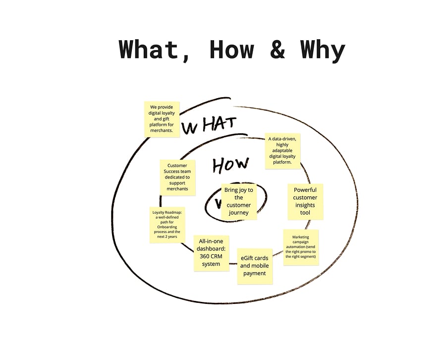
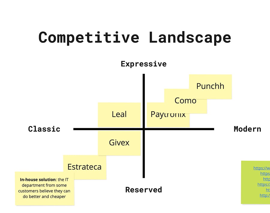
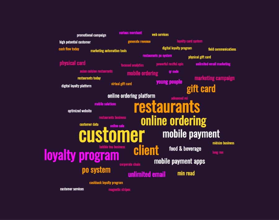
The main challenge for Spoonity was translating a complex, data-driven B2B loyalty platform into an inviting, human-centered brand experience. While their software powered POS integrations, omnichannel analytics, and revenue growth behind the scenes, their visual presence needed to connect with both merchants and end-users on an emotional level.

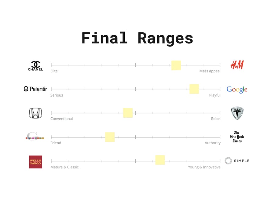
As brand identity and digital design specialists at UIO Studio, we collaborated with Brighten Creative to craft a scalable visual identity system and web direction. Our goal was to bridge high-tech functionality with the genuine joy of customer loyalty, creating an adaptable design architecture for global B2B markets.

The Objective

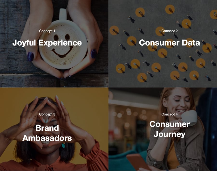
Spoonity’s platform relies on a key principle: turning everyday transactions into meaningful, long-term customer relationships. To articulate this value proposition across English and Spanish-speaking markets, our creative strategy was built around four foundational pillars:

Joy & Connection: Humanizing software by focusing on the rewarding experience of brand loyalty.
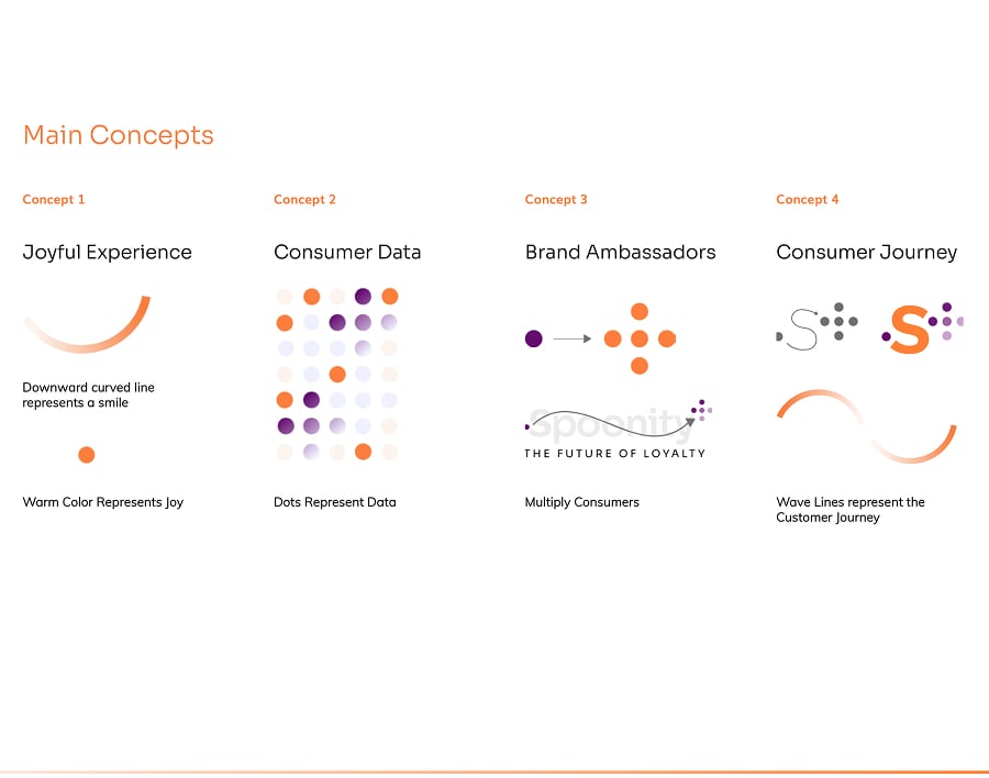
Data Transparency: Representing complex POS metrics and customer insights through clear, accessible visual metaphors.
Brand Advocacy: Symbolizing the exponential value created when loyal customers become brand ambassadors.
Scalable Flexibility: Crafting a modular identity capable of seamlessly adapting to web, sales collateral, product UI, and physical marketing environments.
Our Solutions

Industry

B2B Tech / SaaS & Retail Loyalty

Location

Canada / Global

Project Completition

6 months

Our Innovative Process

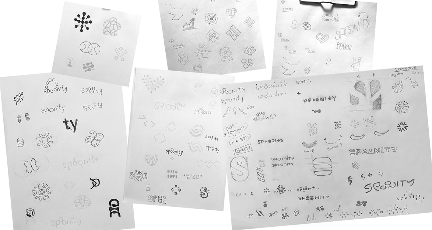
To transform Spoonity’s core strategy into an expansive visual language, we developed a system driven by customer movement, data, and growth:

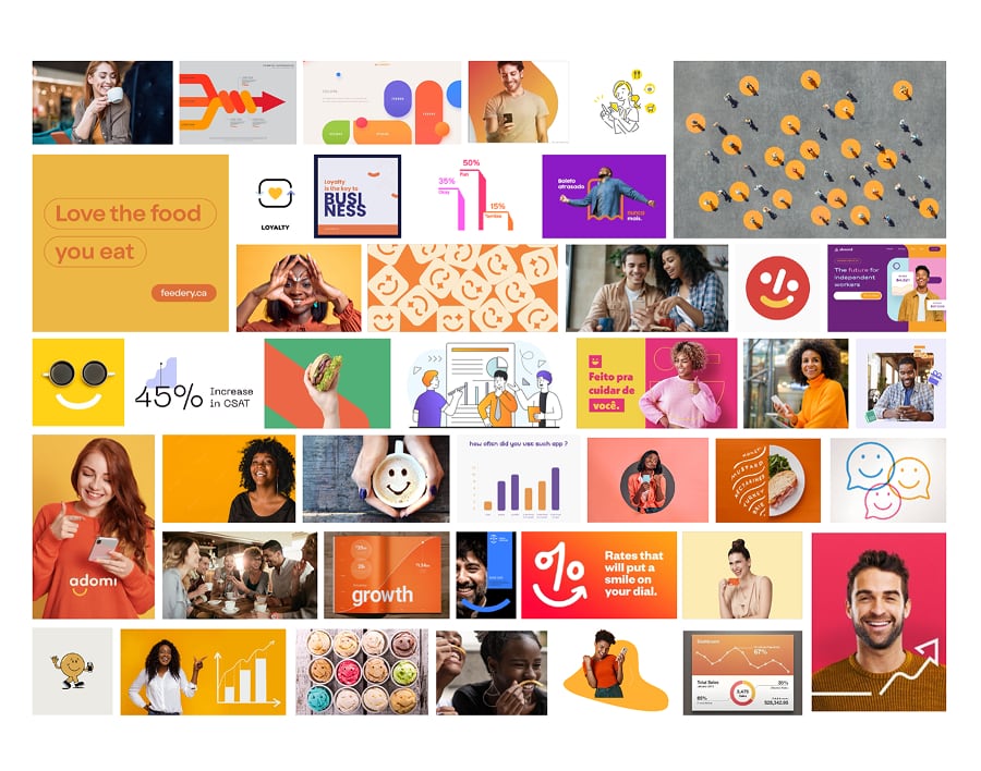
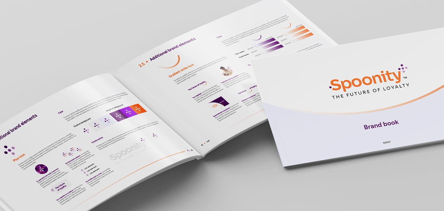
THE DOT SYSTEM & MULTIPLICATION: We designed a dynamic graphic motif where single dots represent individual customers. As engagement grows, these dots form plus-shaped clusters, visually telling the story of customer advocacy and business expansion.
DYNAMIC GRADIENTS & MOVEMENT: Soft gradient lines and organic curves were introduced to visually illustrate the customer journey, injecting fluid movement and energy across digital and print touchpoints.
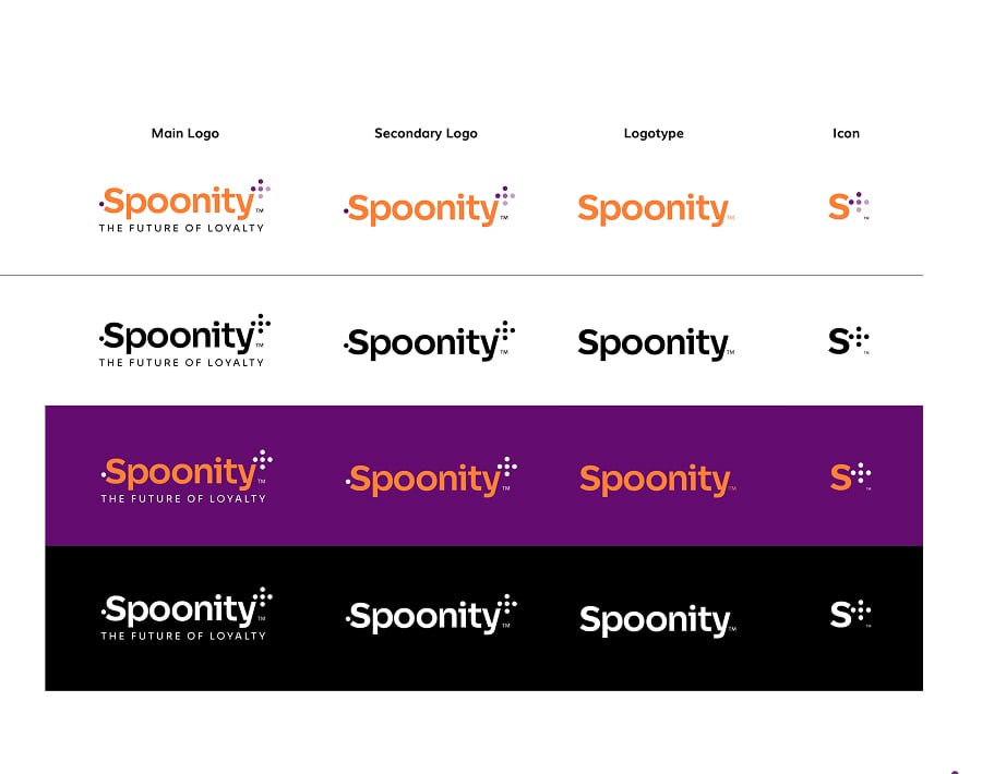
BALANCED COLOR PALETTE: A vibrant orange and purple palette was selected to hit the sweet spot between friendly optimism and tech-forward innovation, setting Spoonity apart from traditional corporate SaaS competitors.
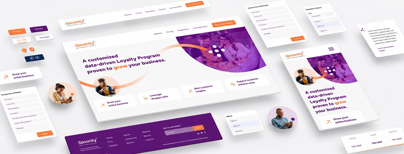
MODULAR WEB & UI DIRECTION: We established a comprehensive UI kit and design system featuring rounded container layouts, custom product mockups, and structured typography to simplify complex product features for B2B buyers.

Before

After

The Unleashed Outcome

The resulting brand system successfully elevates Spoonity from a functional software provider to a standout loyalty platform brand. By combining emotional storytelling with technical structure, UIO Studio delivered a cohesive, multi-market visual identity.
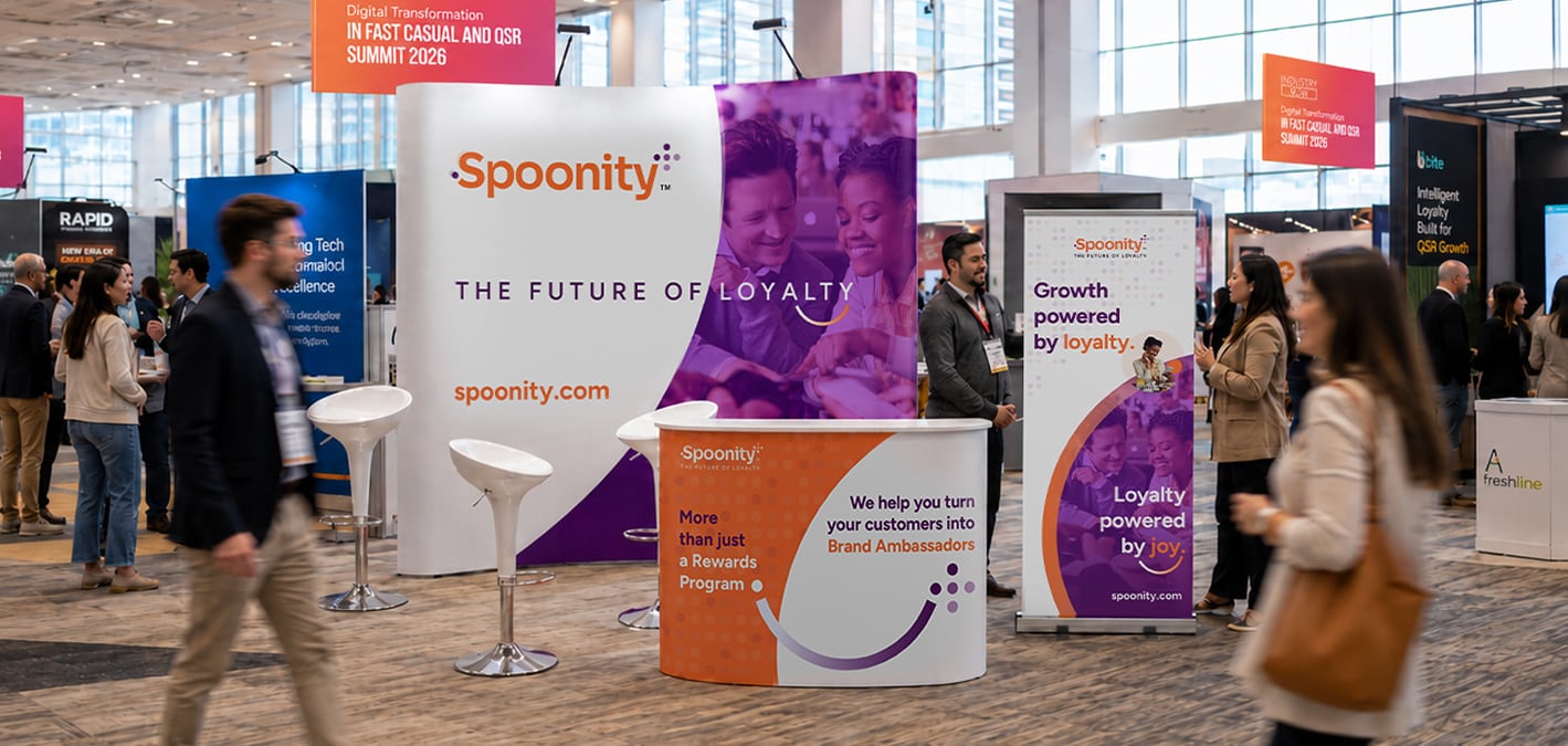
The comprehensive system spans digital product touchpoints, high-impact marketing collateral, and sales assets, equipping Spoonity with a scalable design foundation built to drive B2B growth and long-term brand equity.

Take a look at our final work for ​

Spoonity

More projects

You liked it, didn't you?

We can unleash something incredible for you as well.